Continente Online Checkout
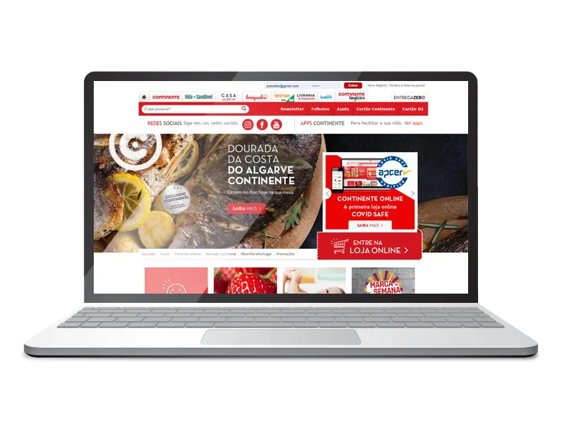
Continente is the largest retailer in Portugal and Continente Online is the company's e-commerce website. Due to its multi-store nature and wide range of products, in 2014 the Continente Online checkout needed an upgrade to provide a more intuitive and efficient user experience, while delivering more functionalities required by customers and business.
Empathise
Define
Point of View — Problem Statement (dummy data used for illustration)
| User | Need | Insight |
|---|---|---|
| A customer with a full time job and two young children. | To fill the pantry with food and buy medicines without prescription for his children. | He doesn't know food and medicines have different lead times until the checkout delivery page, generating dissatisfaction and abandonment. |
| An executive that travels quite often and buys all his clothes, shoes, electronics and groceries online. | To buy his groceries quickly to fit this task in his busy schedule. | He expects the site to remember his usual options, like payment method and delivery address, to keep the checkout precise and efficient. |
| A customer that follows weekly promotions and has a tight budget. | To know how much money she can save with the loyalty card coupons. | Knowing which products have a coupon and how much she can save makes her feel more confident about her choices. |
Ideate
"How Might We" questions
Brainstorming and challenge assumptions
The brainstorming technique was used multiple times to gather new ideas and challenge assumptions — whenever possible we talked with team members or other departments who knew these topics better, and questioned whether we could follow another path. Most of the time we found the initial assumptions didn't hold, or the experience could be improved.
Sketches
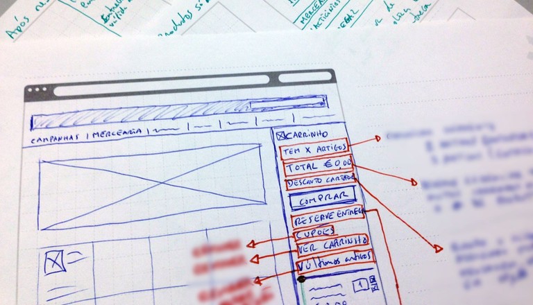
I can't show the dozens of sketches that were made on paper and whiteboard, but this was crucial to explore better solutions and approaches that wouldn't work further ahead, before starting to prototype.
Prototype
Typography and color
User flow
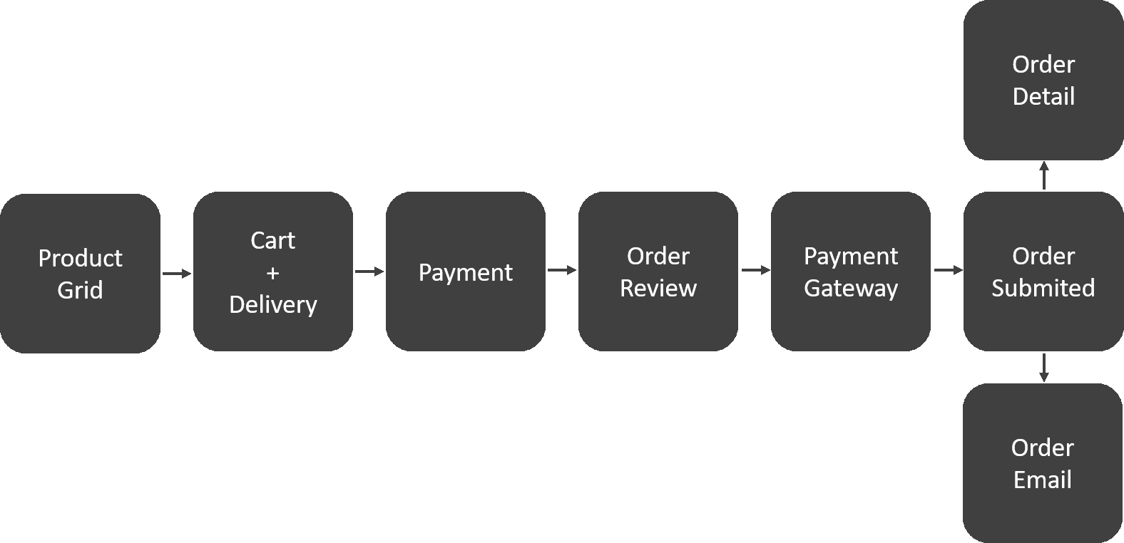
Although the main focus was the checkout, we wanted to test the prototype with real customers. This way, to put the user in context, we needed a product grid page, to allow adding products to the cart before moving on to the checkout. After submitting the order, customers could also check the order confirmation email and order detail page in the account.
Prototyping
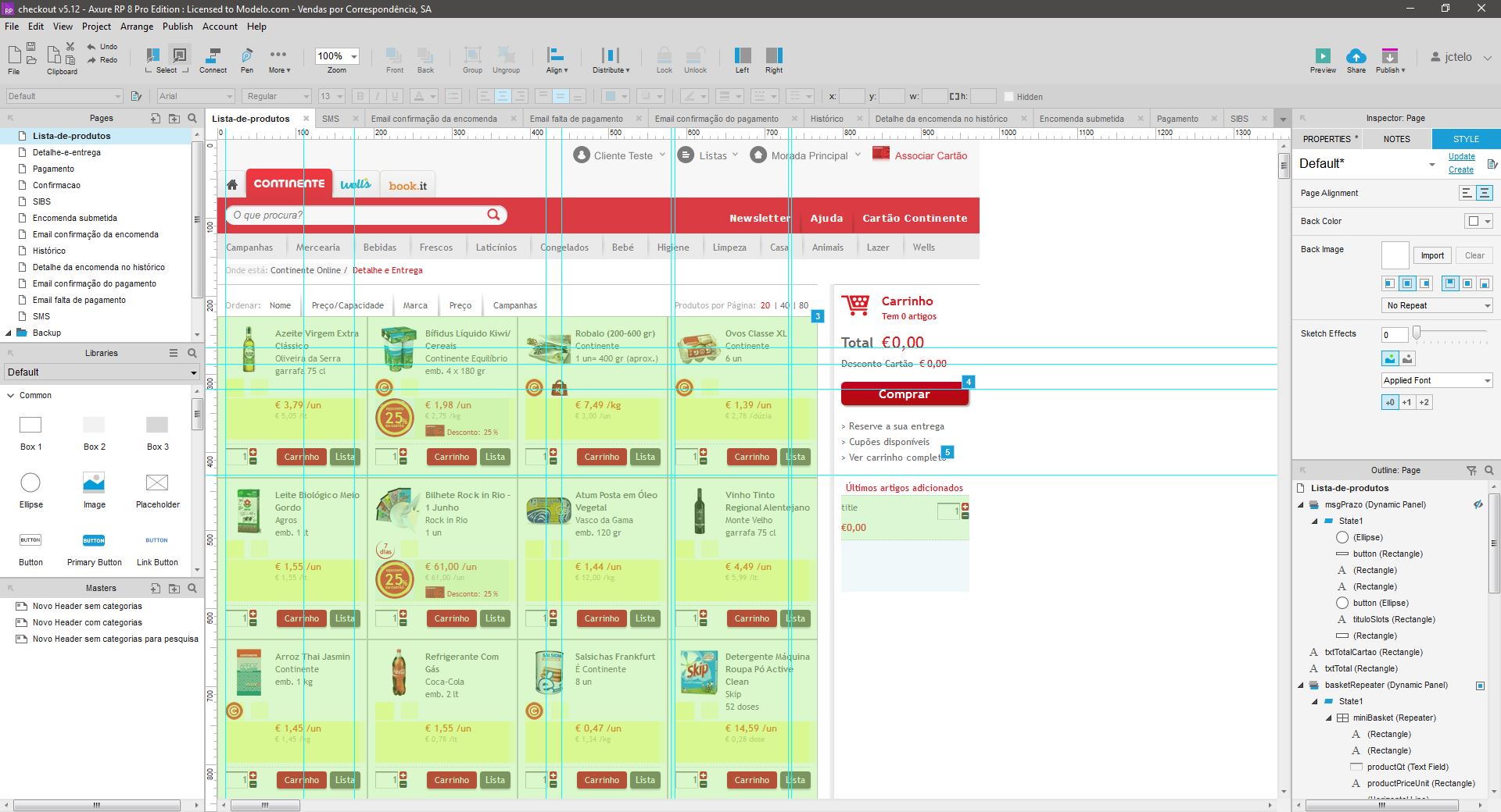
Axure RP was the tool of choice because I needed to build a fully functional cart and checkout for desktop (the site was not responsive at the time). These were the requirements for the prototype:
Test
We tested the prototype during days with real customers, in a one-way mirror lab, recording screen and audio, and using eye-tracking technology to measure eye movement while interacting with the prototype. I attended all the usability tests, making real-time changes to fix issues pointed out by users and testing them again with the following customers.
This prototype was also used as a deliverable to the development team, making it a lot easier to understand the requirements and specificity of some interactions. Despite the high complexity of this checkout process, development went smoothly. After development, I made extensive usability tests to guarantee the final experience followed the defined requirements.
End result
In the end, customers had a better understanding of all the options and order values, and quicker access to the core options of the checkout, providing a more efficient, trustful, intuitive, and pleasing buying experience. Since the deployment, we saw a big improvement in customer satisfaction, a substantially higher conversion rate, and a reduction of the time spent on the checkout pages.
This project was very challenging but really satisfying: