The new Continente Online

Continente is the largest retailer in Portugal and Continente Online is the company’s e-commerce website. The previous version of the Continente Online website was released in 2013. As you may expect, an update to today’s standards was needed, especially because it wasn’t mobile-friendly and responsive. At the same time, this was an opportunity to solve most of the pain points and improve the user experience.
Due to my experience in e-commerce and expertise in User Experience, my role in this 4 years project was very broad, playing a lead role in each phase, as described below.
Foundational and design research
A great part of the project was invested in research and strategy, to support design, business decisions, and also to manage priorities. We already collected a lot of information about our users, but we really wanted to deeply understand their feelings, thoughts, needs, desires, pain points and behaviors.
To achieve this, we used multiple data sources and the previous website to better understand our users. Throughout the project, we validated concepts with usability tests, interviews and focus groups. This preparation work was essential to the project because it created the needed empathy between our users, the project team, partners and stakeholders.
Since my team was responsible for SEO, web analytics and customer insights, I worked closely with them and the project team in the definition and delivery of the core metrics, which included also the development of a custom web analytics system.
Sonae MC’s market research team was another fundamental part of the process. We already worked with them on other projects and we knew that the qualitative and quantitative data that they bring is gold. This way, I collaborated with them to define usability test scenarios, scripts and user flows. There were multiple user tests during the project, with different technology and research goals.
After defining the requirements lists, we created a comparison matrix that was applied to main competitors and reference retailers. This competitive audit was made by me.

Defining user and business needs
From day one we were committed to being rigorous and transparent with all aspects of the project. Thanks to the brilliance of my area leader and our project manager, everything was under tight control, and we synced regularly with the key stakeholders to let them know what we were doing and how.
At this stage, I worked closely with the project team to define project goals, challenges and value proposition, as well with business, IT and partners to specify in detail the functional and technical requirements. A website like this has hundreds of requirements, rules, details and specificities of the business that you won’t believe, that needed to be answered assertively and quickly. I won’t lie to you. The discovery phase was very hard for all teams.
Until the end of the project, some clarifications and adjustments to the requirements were needed, where I provided additional mockups, screens, prototypes and flows.
Discovery can be overwhelming, but this was also the time to encourage teams to challenge assumptions and think out of the box, taking advantage of the Salesforce platform and the opportunity to create a new experience. Occasions like this are very rare and we couldn’t miss this one.
Talking about opportunities, the new platform was a golden chance to fix all the well-known weaknesses in SEO and web analytics of the previous platform. After planning this implementation with my team’s specialist, he did an outstanding job, documenting in detail the needed requirements for both areas. The end result was stellar, with a 100% score in the Lighthouse SEO report in Chrome DevTools, and a Universal Analytics and Google Analytics 4 implementation with dozens of metrics all supported by data layers.


Ideation

As expected in a long project like this one, we did several ideation sessions, like the design sprint at the beginning of the project, with cross-functional teams, to define the main experience scenarios to validate with customers.
Later, I co-organized workshops with a multidisciplinary team to brainstorm solutions to the identified problems and challenges. The workshops were divided into multiple sessions during 3 months, wherein each we posted personas, relevant research data and insights in the room walls, to be reviewed during the exercises. These exercises consisted of creating user stories, user journey mapping, problem statements, hypothesis statements, sketches and others. The output of these workshops was the definition of the main experience for multiple scenarios, supported by a large set of low fidelity screens, agnostic to the e-commerce platform and MVP requirements.

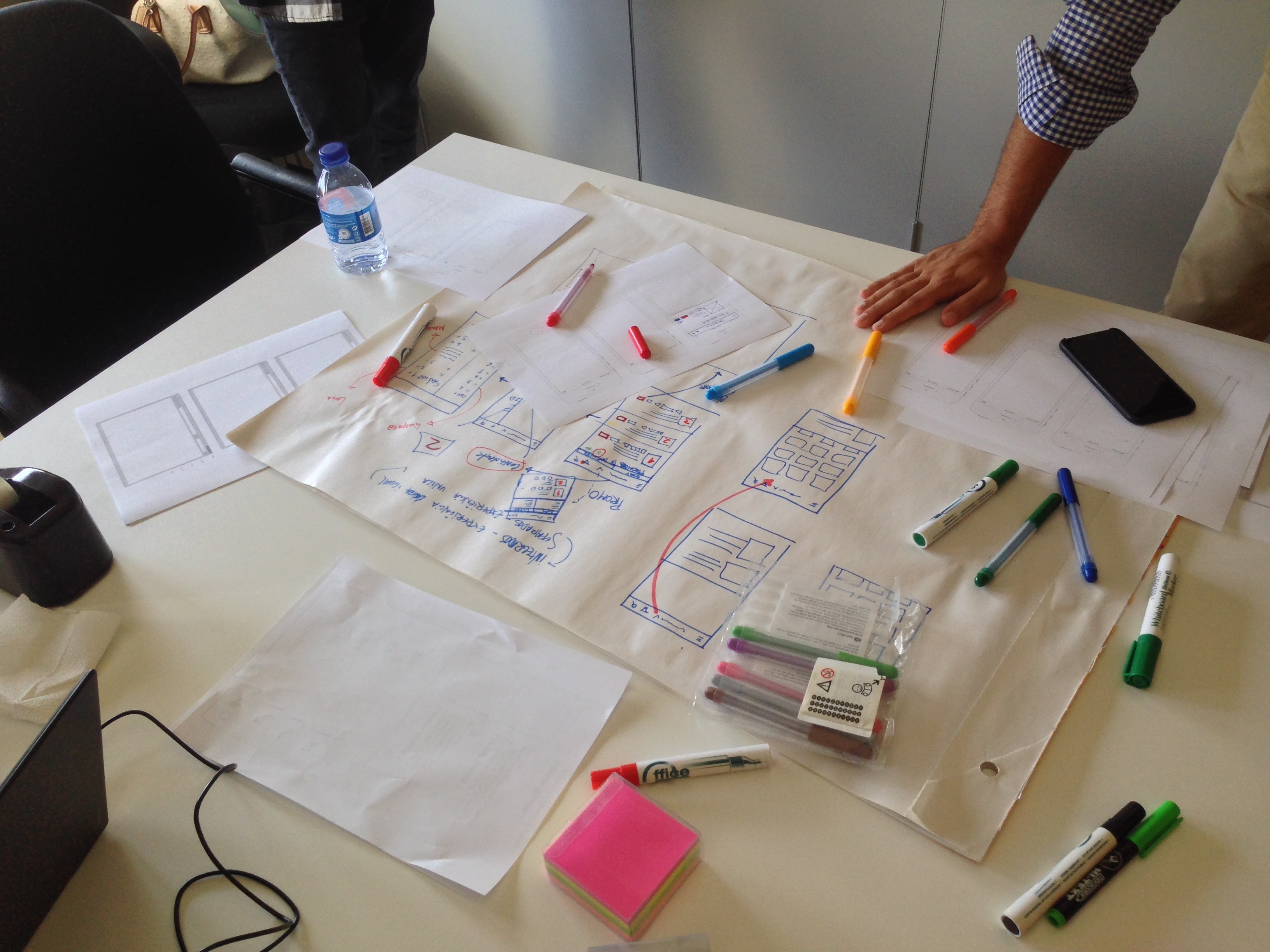


During the discovery phase, while we were defining the requirements of each drop with a partner, another was crafting the designs. As we progressed, I had to evaluate all the designs in all breakpoints (in the corresponding devices), the style guide, and give feedback to the partner. More than a thousand designs were produced and validated! In some cases, a new approach was needed, where I provided new designs, flows and prototypes.

Frequently, I presented designs, prototypes and concepts to the key stakeholders, including board members, to assure the needed commitment with our decisions.
I also specified and reviewed a first approach of the design system, to guarantee that future releases follow the same rules and principles defined by the project team.
Prototyping
Prototypes are essential to validate concepts and user testing. When in need, Balsamiq Mockups was used for a quick wireframe or clickable prototype. This could happen during a meeting, a design sprint, a discovery or a problem-solving session. This tool prototypes are simple PDF files with links between pages but are more than enough to test and display a concept.
Each time we needed user validation or to explain a functionality in more detail, I prepared clickable InVision prototypes for the defined breakpoints (mobile, tablet and desktop), according to the use cases and scripts. Often, additional screens were needed to build the story that we wanted to present to users and, in these cases, I crafted new designs in Sketch.


A lot of time was invested in prototypes, but it always paid off. Even with functionalities that passed to the backlog, we used prototypes to explain the idea to stakeholders and to test acceptance with users. Later, we can use this information to evaluate the priority and desirability of these functionalities.
Until the end product, the prototypes were used as a deliverable to IT, marketing and partners, making it a lot easier to understand the requirements and specificity of some interactions.
Testing, testing, testing

Since I work as a UX Specialist, I insist on attending almost all usability tests and interviews. As expected in a project of this dimension, we did multiple tests in different stages of the project, to see firsthand not only what users say, but also their behaviors, mood, expressions and body language. Cutting-edge technology was used to measure the interaction and emotions of users while using our prototypes and the end product, with a focus in mobile and desktop devices.
Taking advantage of my presence in these tests, after verifying the same issue with 5 users (“Why You Only Need to Test with 5 Users” by Jakob Nielsen) whenever possible, I quickly implemented fixes to test with the following users. This methodology was always aligned with our market research team and partner to assure that the results were not biased by these changes.
During and after development, I made extensive usability and functional tests in all breakpoints to guarantee that the final experience followed the defined requirements.
End result
At the moment I’m writing this, the site and app were already released. We are delivering a completely new experience, but we built it in a way that should remain familiar to our customers and be easily adopted by new users. The feedback that we are receiving from our customers is immensely positive and it’s aligned with the output they gave us in the last usability tests and interviews. Also, the core business metrics show us that the new experience is being welcomed. So, we are very happy with the end result.

Still, we are dissatisfied by nature. The development of a website of this magnitude doesn’t end in the go-live. We have a demanding roadmap in the short and medium-term, and we know by heart what parts of the experience we want to fine-tune. The new www.continente.pt is a major improvement over the previous one, but it will still get better. We have built much more than a website and, with time, you’ll understand what I mean.
Looking at all that happened in the last four years, I’m amazed and proud of the work done by our teams and partners. This was a project of a lifetime, with so many challenging and difficult times, but these are the moments that make us grow as a person and professional.
It was a great pleasure to meet and work with so many talented people, that it would be unfair to mention some names. You know who you are 😉. Thank you!
Update, 29 November 2021
The project team for the new Continente e-commerce website received an award at Sonae MC's annual convention. As one of the representatives of this team, I leave a big thank you to all the teams involved. This wouldn't be possible without you.


